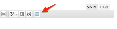
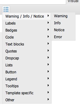
GavernWP allows to access a lot of additional typography elements created with Shortcodes use. The use is very simple thanks to an additional button in a posts editor. A typography description from a programistic side has been divided into two parts, namely: front-end and back-end.
Below, there are all elements available in theme’s typography. Typography elements can be divided into three main groups:
- typography elements,
- interactive elements,
- elements prepared especially for a particular theme.
Warnings / Infos / Notices / Errors
These elements are used for highlighting text fragments together with their importance / type of information by using appropriate colors.
[warning]Warning text example using Shortcodes[/warning]
[info]Info text example using Shortcodes[/info]
[notice]Notice text example using Shortcodes[/notice]
[error]Error text example using Shortcodes[/error]
Labels
Labels are useful for marking the importance of the text fragment or a word given. In the case of longer texts, we recommend to use elements from Warnings / Infos / Notices group.
This is a paragraph with the [label style=”1″]labeled text[/label] using the first style.
This is a paragraph with the [label style=”2″]labeled text[/label] using the second style.
This is a paragraph with the [label style=”3″]labeled text[/label] using the third style.
This is a paragraph with the [label style=”4″]labeled text[/label] using the fourth style.
This is a paragraph with the [label style=”5″]labeled text[/label] using the fifth style.
This is a paragraph with the [label style=”6″]labeled text[/label] using the sixth style.
Badges
Badges in their look are similar to Labels, however, you may use them mainly for highlighting shorter texts, e.g. numerical values.
This is a paragraph with the badge [badge style=”1″]12[/badge] using the first style.
This is a paragraph with the badge [badge style=”2″]12[/badge] using the second style.
This is a paragraph with the badge [badge style=”3″]12[/badge] using the third style.
This is a paragraph with the badge [badge style=”4″]12[/badge] using the fourth style.
This is a paragraph with the badge [badge style=”5″]12[/badge] using the fifth style.
This is a paragraph with the badge [badge style=”6″]12[/badge] using the sixth style.
Code listings
We recommend to use an element creating code listings in one out of three styles available for presenting source codes:
[code style=”1″]function helloWorld() {
alert(‘Hello World!’);
}[/code]
[code style=”2″]function helloWorld() {
alert(‘Hello World!’);
}[/code]
[code style=”3″]function helloWorld() {
alert(‘Hello World!’);
}[/code]
Text blocks
Text blocks are useful for generating an element highlighting a particular part of an entry:
[textblock style=”1″]Lorem ipsum dolor sit amet, consectetur adipiscing elit. Nullam quis risus eget urna mollis ornare vel eu leo.[/textblock]
[textblock style=”2″]Lorem ipsum dolor sit amet, consectetur adipiscing elit. Nullam quis risus eget urna mollis ornare vel eu leo.[/textblock]
[textblock style=”3″]Lorem ipsum dolor sit amet, consectetur adipiscing elit. Nullam quis risus eget urna mollis ornare vel eu leo.[/textblock]
[textblock style=”4″]Lorem ipsum dolor sit amet, consectetur adipiscing elit. Nullam quis risus eget urna mollis ornare vel eu leo.[/textblock]
[numblock num=”01″ style=”1″]Lorem ipsum dolor sit amet, consectetur adipiscing elit. Nullam quis risus eget urna mollis ornare vel eu leo.[/numblock]
[numblock num=”02″ style=”2″]Lorem ipsum dolor sit amet, consectetur adipiscing elit. Nullam quis risus eget urna mollis ornare vel eu leo.[/numblock]
[numblock num=”03″ style=”3″]Lorem ipsum dolor sit amet, consectetur adipiscing elit. Nullam quis risus eget urna mollis ornare vel eu leo.[/numblock]
[numblock num=”04″ style=”4″]Lorem ipsum dolor sit amet, consectetur adipiscing elit. Nullam quis risus eget urna mollis ornare vel eu leo.[/numblock]
Fusce dapibus, tellus ac cursus commodo, tortor mauris condimentum nibh, ut fermentum massa justo sit amet risus. Nullam id dolor id nibh ultricies vehicula ut id elit. Aenean eu leo quam. Pellentesque ornare sem lacinia quam venenatis vestibulum. Duis mollis, est non commodo luctus, nisi erat porttitor ligula, eget lacinia odio sem nec elit. [floated align=”left”]Lorem ipsum dolor sit amet[/floated]
Fusce dapibus, tellus ac cursus commodo, tortor mauris condimentum nibh, ut fermentum massa justo sit amet risus. Nullam id dolor id nibh ultricies vehicula ut id elit. Aenean eu leo quam. Pellentesque ornare sem lacinia quam venenatis vestibulum. Duis mollis, est non commodo luctus, nisi erat porttitor ligula, eget lacinia odio sem nec elit. [floated align=”right”]Lorem ipsum dolor sit amet[/floated]
Lorem ipsum dolor sit amet, consectetur adipiscing elit. Nullam quis risus eget urna mollis ornare vel eu leo. Fusce dapibus, tellus ac cursus commodo, tortor mauris condimentum nibh, ut fermentum massa justo sit amet risus. Nullam id dolor id nibh ultricies vehicula ut id elit. [floated align=”center”]Lorem ipsum dolor sit amet[/floated] Aenean eu leo quam. Pellentesque ornare sem lacinia quam venenatis vestibulum. Duis mollis, est non commodo luctus, nisi erat porttitor ligula, eget lacinia odio sem nec elit.
Quote and Citations
Quotes elements are useful for highlighting the author of a sentence given:
[quote style=”1″ author=”Author”]The content of the quote in style 1[/quote]
[quote style=”2″ author=”Author”]The content of the quote in style 2[/quote]
[quote style=”3″ author=”Author”]The content of the quote in style 3[/quote]
[quote style=”4″ author=”Author”]The content of the quote in style 4[/quote]
[quote style=”5″ author=”Author”]The content of the quote in style 5[/quote]
Lists
Ordered and unordered lists:
[olist style=”1″]
item1
item2
item3
[/olist]
[olist style=”2″]
item1
item2
item3
[/olist]
[olist style=”3″]
item1
item2
item3
[/olist]
[olist style=”4″]
item1
item2
item3
[/olist]
[ulist style=”1″]
item1
item2
item3
[/ulist]
[ulist style=”2″]
item1
item2
item3
[/ulist]
[ulist style=”3″]
item1
item2
item3
[/ulist]
[ulist style=”4″]
item1
item2
item3
[/ulist]
Buttons
Buttons in many different variations:
[button style=”1″]Your text[/button] [button style=”2″]Your text[/button] [button style=”3″]Your text[/button] [button style=”4″]Your text[/button] [button style=”5″]Your text[/button] [button style=”6″]Your text[/button] [button style=”7″]Your text[/button]
The same buttons as links:
[button style=”1″ url=”#”]Your text[/button] [button style=”2″ url=”#”]Your text[/button] [button style=”3″ url=”#”]Your text[/button] [button style=”4″ url=”#”]Your text[/button] [button style=”5″ url=”#”]Your text[/button] [button style=”6″ url=”#”]Your text[/button] [button style=”7″ url=”#”]Your text[/button]
Legends
Elements with legend useful while creating text blocks in a frame provided with an appropriate title.
[legend title=”Legend style 1″ style=”1″]Lorem ipsum dolor sit amet, consectetur adipiscing elit. Nullam quis risus eget urna mollis ornare vel eu leo.[/legend]
[legend title=”Legend style 2″ style=”2″]Lorem ipsum dolor sit amet, consectetur adipiscing elit. Nullam quis risus eget urna mollis ornare vel eu leo.[/legend]
[legend title=”Legend style 3″ style=”3″]Lorem ipsum dolor sit amet, consectetur adipiscing elit. Nullam quis risus eget urna mollis ornare vel eu leo.[/legend]
[legend title=”Legend style 4″ style=”4″]Lorem ipsum dolor sit amet, consectetur adipiscing elit. Nullam quis risus eget urna mollis ornare vel eu leo.[/legend]
[legend title=”Legend style 5″ style=”5″]Lorem ipsum dolor sit amet, consectetur adipiscing elit. Nullam quis risus eget urna mollis ornare vel eu leo.[/legend]
Raw text
An element useful for generating text without formatting:
[raw]Your text[/raw]
Tooltips
Tooltips may occur in two forms: a link to a different website with a tooltip or a text connected with the text:
[tip label=”Default style” style=”1″ href=”URL”]Text of the tooltip[/tip]
[tip label=”Blue style” style=”2″ href=”URL”]Text of the tooltip[/tip]
[tip label=”Red style” style=”3″ href=”URL”]Text of the tooltip[/tip]
[tip label=”Green style” style=”4″ href=”URL”]Text of the tooltip[/tip]
[tip label=”Yellow style” style=”5″ href=”URL”]Text of the tooltip[/tip]
Other typography elements
Elements which could not be groupped to other categories.
Columns allow to place text in multicolumn layout:
[columns]
[column]Content for the first column[/column]
[column]Content for the second column[/column]
[column]Content for the third column[/column]
[/columns]
You can also adjust the columns width using the width attribute:
[columns width=”50,25,25″]
[column]Content for the first column[/column]
[column]Content for the second column[/column]
[column]Content for the third column[/column]
[/columns]
Toggle text – elements useful for creating blocks with text to toggle:
[toggle header=”Header text”]Cras mattis consectetur purus sit amet fermentum. Duis mollis, est non commodo luctus, nisi erat porttitor ligula, eget lacinia odio sem nec elit. Maecenas sed diam eget risus varius blandit sit amet non magna. Donec id elit non mi porta gravida at eget metus. Maecenas sed diam eget risus varius blandit sit amet non magna. Maecenas sed diam eget risus varius blandit sit amet non magna. Praesent commodo cursus magna, vel scelerisque nisl consectetur et. Fusce dapibus, tellus ac cursus commodo, tortor mauris condimentum nibh, ut fermentum massa justo sit amet risus. Sed posuere consectetur est at lobortis.[/toggle]
[toggle header=”Header text” open=”true”]Cras mattis consectetur purus sit amet fermentum. Duis mollis, est non commodo luctus, nisi erat porttitor ligula, eget lacinia odio sem nec elit. Maecenas sed diam eget risus varius blandit sit amet non magna. Donec id elit non mi porta gravida at eget metus. Maecenas sed diam eget risus varius blandit sit amet non magna. Maecenas sed diam eget risus varius blandit sit amet non magna. Praesent commodo cursus magna, vel scelerisque nisl consectetur et. Fusce dapibus, tellus ac cursus commodo, tortor mauris condimentum nibh, ut fermentum massa justo sit amet risus. Sed posuere consectetur est at lobortis.[/toggle]
Shortcode pageurl allows to place an address to a blog:
[pageurl]
A link to a RSS channel:
[rss href=”URL”]Link text[/rss]
A link to a PDF document:
[pdf url=”URL”]Text of the link[/pdf]
A private note in an entry, visible for an author only:
[note]Your private note[/note]
Mail illegible for bots creating data bases for spammers:
[mail]email.to@obfuscate.com[/mail]
Content visible for logged in users only:
Members onlyContent for the members only
Related posts:
[related limit=”5″]