Tag Archives: CSS

Typography button

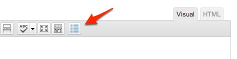
To simplify shortcodes use available in themes based on GavernWP framework, a button for theme’s typography has been implemented which is available in a posts editor:meetgavernwp_typo1


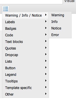
By clicking this button, you will see a list of available typography elements:meetgavernwp_typo2


It is possible to choose a version with a stylistic specified for the majority of elements. After choosing a particular style, a shortcode will appear which will be replaced in entry content by scripts to structure styled in a way given.

Please, note that adding a new Shortcode code requires three operations:

  • adding an entry in shortcodes.js configuration file
  • adding PHP code supporting a shortcode given
  • adding optional CSS and JavaScript code (if a shortcode given requires it)

shortcodes.js file in config catalog includes entries which are replaced to menu structure visible after clicking a typography button – it includes $GAVERNWP_SHORTCODES variable which is a table including objects representing elements of a menu. Each object has three features: title, code and submenu. Let’s analyze this structure with a Highlight position:

[code]{

“title”: “Highlight”,
“code”: “[highlight]Your text[/highlight]”,
“submenu”: [
{
“title”: “Style I”,
“code”: “[highlight style=\”1\”]Your text[/highlight]”
},
{
“title”: “Style II”,
“code”: “[highlight style=\”2\”]Your text[/highlight]”
},
{
“title”: “Style III”,
“code”: “[highlight style=\”3\”]Your text[/highlight]”
}
]
},[/code]

  • title – it includes a menu positon name displayed by a script
  • code – it is a shortcode code which will be added to an entry when clicking a menu position given – you have to remember that not all menu positions on the first level have a value in this field – if it was an empty sequence of symbols, it means for a script that clicking on a menu position given does not request any action.
  • submenu – it is a table  of a submenu of a menu position given. Each submenu position is built the same as menu positions as these on the first level but with one difference – a submenu cannot have the next submenu, so you do not add a submenu feature in a submenu object.

Let’s say, we added our shortcode to a typography button using shortcodes.js file. So, there is one thing left to do – support our shortcode from a theme side.

To do this, you have to open gavern/helpers/helpers.shortcodes.php file.

This file is divided into three main sections starting with lines similar to:

[code]if(get_option($tpl->name . ‘_shortcodes1_state’, ‘Y’) == ‘Y’) {[/code]

It is a conditional  IF instruction connected with a group of typography elements given. Gavern icludes three groups:

  • typography elements – functions connected with it have gavern_ts_ prefix in the title
  • interactive elements – functions connected with it have gavern_ies_ prefix in the title
  • elements characteristic for a particular theme – functions connected with it have gavern_tss_ prefix in the title

We recommend to add new typography elements in the last group – in Meet GavernWP theme, it is empty by default. Please, remember about using an appropriate prefix in a function name for a group given, e.g. in the case of the third group, it will be gavern_tss_. The code itself of a shortcode given has to be created according to guidelines described in Shortcode API.

The last step is rather optional and depends on your Shortcode type. If your Shortcode requires additional CSS or JavaScript code, you have to define it in shortcodes.*.css i shortcodes.*.js files, where * is a group name to which a Shortcode given was assigned.

It is very important to place elements of CSS and JavaScript code in an appropriate file, as it will give a possibility of optimizing whole theme code when switching off given group of Shortcodes codes.

Widget rules

Widget rules is a mechanism which introduces a completely new way to manage widgets on a website. Thanks to it, it is possible to specify widget features such as:

  • displaying on subpages chosen,
  • displaying on devices chosen,
  • displaying for a group of users chosen,
  • displaying with a widget style use chosen.

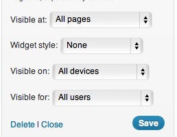
After switching on widget rules in theme’s advanced settings, under each widget, the following options should be displayed:

widgets1

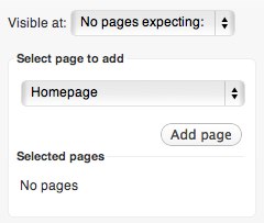
The most extensive options are those connected with a widget visibility on subpages chosen – after choosing an option to show a widget on pages chosen (or an option not showing a widget on pages chosen), such a panel will appear:

widgets2

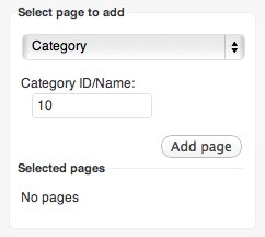
Then, you have to choose a page’s type to add, e.g. Category, and then give category ID:

widgets3

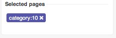
After clicking “Add page” button, a page will appear on a list of pages chosen on which in our case a widget will be displayed:

widgets4

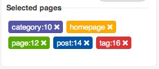
Of course, it is possible to add more pages:

widgets5

To make it clearer, , each page’s type is displayed with a different color. A page added can be removed by clicking a removing icon placed on the right side of each page.

In this way, you may set a widget so as to be shown on pages chosen or to be shown on all pages except the chosen ones.

Recent Updates bring new features. An option of displaying a widget on chosen pages has now twelve options:

  • Homepage
  • Page
  • Post
  • Category
  • Tag
  • Archive
  • Author
  • Page Template (Contact, Gallery, Login, Latest, Tagcloud etc.)
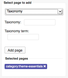
  • Taxonomy (to group things together)

    meetgavern_wp_widget_rules_new1

  • Post type (Other than default e.g. products from shop plugin)
  • Search page
  • 404 page

Generally, widgets are shown on all pages.

An option of displaying a widget on devices chosen has five options to choose:

  • All devices – a widget will be displayed everytwhere – on every device
  • Desktop – a widget will be displayed only when neither a tablet.css file nor a mobile.css is loaded
  • Tablets – a widget displays only when a tablet.css file will be loaded and, at the same time, a mobile.css file will not be loaded
  • Smartphones – a widget will be displayed only when a mobile.css file will be loaded
  • Tablets/Smartphones – a widget will be displayed when at least one file will be loaded: tablet.css or mobile.css.

Thanks to these settings, it is possible to limit significantly the amount of content displayed on devices with small screens.

An option of displaying widget for a chosen groups of users has four options to choose:

  • All users – a widget will be displayed to all users
  • Only guests – a widget will be displayed to not logged in users
  • Only registered users – a widget will be displayed to logged in users only
  • Only administrator – a widget will be displayed to administrators only

Thanks to this option, it is possible e.g. to display messages specified by using widgets for a group of users chosen.

The last optio from widget rules is an option for choosing a widget style – it causes appending to a widget main container an additional class giving styling specified by a user.

Widget styles are defined in widget.styles.json file and in CSS code – in this case in css/wp.extensions.css.

Custom Page Styles

GavernWP makes accessible a few own styles of subpages. Thanks to them, it is possible to use WordPress possiblitities better  and adjusting pages to themes chosen.

All additional subpages styles are placed in a main catalog in template.*.php files. GavernWP has the following subpages:

  • template.archive.php – an archive page, in includes a list of recent posts, categories and a list of links to monthly archives.
  • template.contact.php – a page with a contact form which allows to send an email to an email address specified in a WordPress configuration.
  • template.fullwidth.php – a page’s layout without a sidebar.
  • template.gallery.php – a page generating an animated gallery of images with a mechanism of attachments available in WordPress – it is enough to assign attachments to such a page that they will show as slides in a gallery. It is recommened to choose images with the same size.
  • template.latest.php – a page generating a list of recent posts (with full post content).
  • template.login.php – a page generating a login form for users – after logging in, it displays information about his/her username and a button to log out.
  • template.tagcloud.php – a page generating a tag cloud of our website.

Main CSS styles of subpages are in a css/stuff.css file. However, you have to remember that some more extensive files of subpages may additionally load CSS and JavaScript files from css/templates/ and js/templates/.

In order to load additional files in this way, it is enough to specify the second parameter of a gk_load function (see: code of requesting a gk_load function in a template.gallery.php file).

Comments Features

GavernWP has support for comments with a division into threads. Thanks to it, discussions made in comments under a post given are clearer.

All options connected with comments configuration can be set by using standard options in a WordPress administration panel (Settings > Discussion). Threads in comments are switched on thanks to “Enable threaded (nested) comments” and specifying maximal depth of nested comments in threads.

There are two files responsible for generating HTML code of comments, namely:

  • comments.php – it includes a code which generates a comments list and a form of adding comments.
  • gavern/helpers/helper.layout.fragments.php – in gavern_comment_template function, there is a code responsible for generating a code of a comment given.

CSS code responsible for a style of comments and a form of adding comments is in css/wp.css file.


Meet Gavern has also two new options connected with comments, available in Advanced theme settings:

  • Add target blank to comments links – if this option is enabled, then every link in the comments text will open in new browser tab.
  • Autolinking in comments – if this option is enabled, then every link in the comments text will be automatically changed into hyperlink

Theme CSS

Theme’s CSS code is divided into a few files, loaded in order specified. All these files are in css catalog. You have to remember that order of these files is very important and its change may cause unpredictable changes of theme’s look because of using moving from general styling to detailed styling in CSS code.

The list of CSS files used in a theme is presented below (order according to recommended order of loading these files):

  1. normalize.css – CSS code unifying page’s elements styling in all browsers
  2. template.css – the most important CSS file responsible for page’s layout styling , basic typography, widget styling, etc.
  3. wp.css – CSS rules which are responsible for WordPress elements styling, e.g. a comments form , comments themselves or posts elements.
  4. shortcodes.*.css (optional) – a group of CSS files responsible for typography elements styling inserting to posts with Shortcodes.
  5. stuff.css – it includes styling of additional theme’s elements sucha s breadcrumbs or font-size switcher.
  6. wp.extensions.css – CSS rules connected with styling of standard widgets available with WordPress.
  7. extensions.css (optional) – a CSS file which you have to add yourself in the case when you want to style additional widgets. In the case of small changes in widget styling, we recommend to use override.css file instead of this file.
  8. tablet.css – CSS rules used while displaying a page on tablet devices.
  9. mobile.css – CSS rules used while displaying  a page on smartfon devices.
  10. ie*.css – a file or a group of CSS files used for correcting page’s look in an Internet Explorer browser.
  11. style*.css – a file or a group of CSS files used for changing coloring or general style of a theme – they are loaded automatically by a mechanism responsible for theme’s coloring.
  12. error.css – CSS rules used while displaying a error page.
  13. rtl.css –  CSS rules for language written in a Right-To-Left (RTL) direction.
  14. font-awesome.css – The full suite of Retina ready pictographic icons, e.g. for widget titles.
  15. override.css (optional) – you may add your own rules in this file which will overwrite existing rules in previous files – a perfect solution for theme modification without modifying the remaining CSS files.

Additionally, CSS code used in a theme itself, you will also find in a templates catalog where there are CSS files loaded on chosen styles of subpages, e.g. needed for correct work of a gallery.

Responsive Layout

GavernWP makes possible to create themes based on Responsive Web Design. That’s why, it has two additional CSS styles:

  • tablet.css
  • mobile.css

Thanks to options available in an administration panel, it is possible to specify when these styles will be loaded.

Two column layout (if a column is switched on) is loaded when tablet.css file is not loaded.

At the moment of reaching maximum width for tablet.css file, page’s layout is changed into one column and the column itself is placed before or after page’s main content.

Additionally, in widget positions like top or bottom1/2/3, modules from three column layout are changed into one column  layout.

After loading mobile.css file there is one column layout used everywhere.

A very important improvement is a possibility of specifying whether a module will be loaded in tablet or mobile mode. More information can be found in Widget Rules entry.

Color Styles

GavernWP has an extensive mechanism allowing to create additional theme styles. We may distinguish two main groups of styles in this mechanism:

  • style family
  • styles included in style family given

The whole configuration is included in styles.json file:

[code][{

“family”: “color”,
“family_desc”: “Theme color”,
“family_tooltip”: “You can select one of the theme colors”,
“styles”: [
{
“name”: “Color I”,
“value”: “color1”,
“file”: “style1.css”
},
{
“name”: “Color II”,
“value”: “color2”,
“file”: “style2.css”
}
]
}][/code]

As you can see, it includes color style family which has two styles, namely: Color I and Color II.

In order to create new style family or a style for style family given, it is enough to create a next object in styles.json file and then create CSS files connected with a family given – in the case of color family, these are style1.css and style2.css files.

GavernWP will load CSS files of a style given in a head section – chosen in an administration panel or, if there is a tool for choosing user’s styles switched on, they will be loaded based on a Cookie file storing data about a style used by a user.

You have to remember that for each style family there is at least one CSS file loaded. Therefore, creating coexisting style families like:

  • dark styles and light styles
  • blue styles and green styles

is incorrect because at least one CSS style from each family will be loaded immediately. So the correct one is creating style families responsible for some elements of website styling, e.g. a separate family responsible for website coloring (colors) and a separate one for website background (patterns).

Generally, you have to care about particular style families in order not to overwrite one another.

Typography

GavernWP allows to access a lot of additional typography elements created with Shortcodes use. The use is very simple thanks to an additional button in a posts editor. A typography description from a programistic side has been divided into two parts, namely: front-end and back-end.

Below, there are all elements available in theme’s typography. Typography elements can be divided into three main groups:

  • typography elements,
  • interactive elements,
  • elements prepared especially for a particular theme.

Warnings / Infos / Notices / Errors

These elements are used for highlighting text fragments together with their importance / type of information by using appropriate colors.

[warning]Warning text example using Shortcodes[/warning]

[info]Info text example using Shortcodes[/info]

[notice]Notice text example using Shortcodes[/notice]

[error]Error text example using Shortcodes[/error]

Labels

Labels are useful for marking the importance of the text fragment or a word given. In the case of longer texts, we recommend to use elements from Warnings / Infos / Notices group.

This is a paragraph with the [label style=”1″]labeled text[/label] using the first style.

This is a paragraph with the [label style=”2″]labeled text[/label] using the second style.

This is a paragraph with the [label style=”3″]labeled text[/label] using the third style.

This is a paragraph with the [label style=”4″]labeled text[/label] using the fourth style.

This is a paragraph with the [label style=”5″]labeled text[/label] using the fifth style.

This is a paragraph with the [label style=”6″]labeled text[/label] using the sixth style.

Badges

Badges in their look are similar to Labels, however, you may use them mainly for highlighting shorter texts, e.g. numerical values.

This is a paragraph with the badge [badge style=”1″]12[/badge] using the first style.

This is a paragraph with the badge [badge style=”2″]12[/badge] using the second style.

This is a paragraph with the badge [badge style=”3″]12[/badge] using the third style.

This is a paragraph with the badge [badge style=”4″]12[/badge] using the fourth style.

This is a paragraph with the badge [badge style=”5″]12[/badge] using the fifth style.

This is a paragraph with the badge [badge style=”6″]12[/badge] using the sixth style.

Code listings

We recommend to use an element creating code listings in one out of three styles available for presenting source codes:

[code style=”1″]function helloWorld() {

alert(‘Hello World!’);

}[/code]

[code style=”2″]function helloWorld() {

alert(‘Hello World!’);

}[/code]

[code style=”3″]function helloWorld() {

alert(‘Hello World!’);

}[/code]

Text blocks

Text blocks are useful for generating an element highlighting a particular part of an  entry:

[textblock style=”1″]Lorem ipsum dolor sit amet, consectetur adipiscing elit. Nullam quis risus eget urna mollis ornare vel eu leo.[/textblock]

[textblock style=”2″]Lorem ipsum dolor sit amet, consectetur adipiscing elit. Nullam quis risus eget urna mollis ornare vel eu leo.[/textblock]

[textblock style=”3″]Lorem ipsum dolor sit amet, consectetur adipiscing elit. Nullam quis risus eget urna mollis ornare vel eu leo.[/textblock]

[textblock style=”4″]Lorem ipsum dolor sit amet, consectetur adipiscing elit. Nullam quis risus eget urna mollis ornare vel eu leo.[/textblock]

[numblock num=”01″ style=”1″]Lorem ipsum dolor sit amet, consectetur adipiscing elit. Nullam quis risus eget urna mollis ornare vel eu leo.[/numblock]

[numblock num=”02″ style=”2″]Lorem ipsum dolor sit amet, consectetur adipiscing elit. Nullam quis risus eget urna mollis ornare vel eu leo.[/numblock]

[numblock num=”03″ style=”3″]Lorem ipsum dolor sit amet, consectetur adipiscing elit. Nullam quis risus eget urna mollis ornare vel eu leo.[/numblock]

[numblock num=”04″ style=”4″]Lorem ipsum dolor sit amet, consectetur adipiscing elit. Nullam quis risus eget urna mollis ornare vel eu leo.[/numblock]

Fusce dapibus, tellus ac cursus commodo, tortor mauris condimentum nibh, ut fermentum massa justo sit amet risus. Nullam id dolor id nibh ultricies vehicula ut id elit. Aenean eu leo quam. Pellentesque ornare sem lacinia quam venenatis vestibulum. Duis mollis, est non commodo luctus, nisi erat porttitor ligula, eget lacinia odio sem nec elit. [floated align=”left”]Lorem ipsum dolor sit amet[/floated]

Fusce dapibus, tellus ac cursus commodo, tortor mauris condimentum nibh, ut fermentum massa justo sit amet risus. Nullam id dolor id nibh ultricies vehicula ut id elit. Aenean eu leo quam. Pellentesque ornare sem lacinia quam venenatis vestibulum. Duis mollis, est non commodo luctus, nisi erat porttitor ligula, eget lacinia odio sem nec elit. [floated align=”right”]Lorem ipsum dolor sit amet[/floated]

Lorem ipsum dolor sit amet, consectetur adipiscing elit. Nullam quis risus eget urna mollis ornare vel eu leo. Fusce dapibus, tellus ac cursus commodo, tortor mauris condimentum nibh, ut fermentum massa justo sit amet risus. Nullam id dolor id nibh ultricies vehicula ut id elit. [floated align=”center”]Lorem ipsum dolor sit amet[/floated] Aenean eu leo quam. Pellentesque ornare sem lacinia quam venenatis vestibulum. Duis mollis, est non commodo luctus, nisi erat porttitor ligula, eget lacinia odio sem nec elit.

Quote and Citations

Quotes elements are useful for highlighting the author of a sentence given:

[quote style=”1″ author=”Author”]The content of the quote in style 1[/quote]

[quote style=”2″ author=”Author”]The content of the quote in style 2[/quote]

[quote style=”3″ author=”Author”]The content of the quote in style 3[/quote]

[quote style=”4″ author=”Author”]The content of the quote in style 4[/quote]

[quote style=”5″ author=”Author”]The content of the quote in style 5[/quote]

Lists

Ordered and unordered lists:

[olist style=”1″]
item1
item2
item3
[/olist]
[olist style=”2″]
item1
item2
item3
[/olist]
[olist style=”3″]
item1
item2
item3
[/olist]
[olist style=”4″]
item1
item2
item3
[/olist]
[ulist style=”1″]
item1
item2
item3
[/ulist]
[ulist style=”2″]
item1
item2
item3
[/ulist]
[ulist style=”3″]
item1
item2
item3
[/ulist]
[ulist style=”4″]
item1
item2
item3
[/ulist]

Buttons

Buttons in many different variations:

[button style=”1″]Your text[/button] [button style=”2″]Your text[/button] [button style=”3″]Your text[/button] [button style=”4″]Your text[/button] [button style=”5″]Your text[/button] [button style=”6″]Your text[/button] [button style=”7″]Your text[/button]

The same buttons as links:

[button style=”1″ url=”#”]Your text[/button] [button style=”2″ url=”#”]Your text[/button] [button style=”3″ url=”#”]Your text[/button] [button style=”4″ url=”#”]Your text[/button] [button style=”5″ url=”#”]Your text[/button] [button style=”6″ url=”#”]Your text[/button] [button style=”7″ url=”#”]Your text[/button]

Legends

Elements with legend useful while creating text blocks in a frame provided with an appropriate title.

[legend title=”Legend style 1″ style=”1″]Lorem ipsum dolor sit amet, consectetur adipiscing elit. Nullam quis risus eget urna mollis ornare vel eu leo.[/legend]

[legend title=”Legend style 2″ style=”2″]Lorem ipsum dolor sit amet, consectetur adipiscing elit. Nullam quis risus eget urna mollis ornare vel eu leo.[/legend]

[legend title=”Legend style 3″ style=”3″]Lorem ipsum dolor sit amet, consectetur adipiscing elit. Nullam quis risus eget urna mollis ornare vel eu leo.[/legend]

[legend title=”Legend style 4″ style=”4″]Lorem ipsum dolor sit amet, consectetur adipiscing elit. Nullam quis risus eget urna mollis ornare vel eu leo.[/legend]

[legend title=”Legend style 5″ style=”5″]Lorem ipsum dolor sit amet, consectetur adipiscing elit. Nullam quis risus eget urna mollis ornare vel eu leo.[/legend]

Raw text

An element useful for generating text without formatting:

[raw]Your text[/raw]

Tooltips

Tooltips may occur in two forms: a link to a different website with a tooltip or a text connected with the text:

[tip label=”Default style” style=”1″ href=”URL”]Text of the tooltip[/tip]

[tip label=”Blue style” style=”2″ href=”URL”]Text of the tooltip[/tip]

[tip label=”Red style” style=”3″ href=”URL”]Text of the tooltip[/tip]

[tip label=”Green style” style=”4″ href=”URL”]Text of the tooltip[/tip]

[tip label=”Yellow style” style=”5″ href=”URL”]Text of the tooltip[/tip]

Other typography elements

Elements which could not be groupped to other categories.

Columns allow to place text in multicolumn layout:

[columns]
[column]Content for the first column[/column]
[column]Content for the second column[/column]
[column]Content for the third column[/column]
[/columns]

You can also adjust the columns width using the width attribute:

[columns width=”50,25,25″]
[column]Content for the first column[/column]
[column]Content for the second column[/column]
[column]Content for the third column[/column]
[/columns]

Toggle text – elements useful for creating blocks with text to toggle:

[toggle header=”Header text”]Cras mattis consectetur purus sit amet fermentum. Duis mollis, est non commodo luctus, nisi erat porttitor ligula, eget lacinia odio sem nec elit. Maecenas sed diam eget risus varius blandit sit amet non magna. Donec id elit non mi porta gravida at eget metus. Maecenas sed diam eget risus varius blandit sit amet non magna. Maecenas sed diam eget risus varius blandit sit amet non magna. Praesent commodo cursus magna, vel scelerisque nisl consectetur et. Fusce dapibus, tellus ac cursus commodo, tortor mauris condimentum nibh, ut fermentum massa justo sit amet risus. Sed posuere consectetur est at lobortis.[/toggle]

[toggle header=”Header text” open=”true”]Cras mattis consectetur purus sit amet fermentum. Duis mollis, est non commodo luctus, nisi erat porttitor ligula, eget lacinia odio sem nec elit. Maecenas sed diam eget risus varius blandit sit amet non magna. Donec id elit non mi porta gravida at eget metus. Maecenas sed diam eget risus varius blandit sit amet non magna. Maecenas sed diam eget risus varius blandit sit amet non magna. Praesent commodo cursus magna, vel scelerisque nisl consectetur et. Fusce dapibus, tellus ac cursus commodo, tortor mauris condimentum nibh, ut fermentum massa justo sit amet risus. Sed posuere consectetur est at lobortis.[/toggle]

Shortcode pageurl allows to place an address to a blog:

[pageurl]

A link to a RSS channel:

[rss href=”URL”]Link text[/rss]

A link to a PDF document:

[pdf url=”URL”]Text of the link[/pdf]

A private note in an entry, visible for an author only:

[note]Your private note[/note]

Mail illegible for bots creating data bases for spammers:

[mail]email.to@obfuscate.com[/mail]

Content visible for logged in users only:

Members onlyContent for the members only

Related posts:

[related limit=”5″]